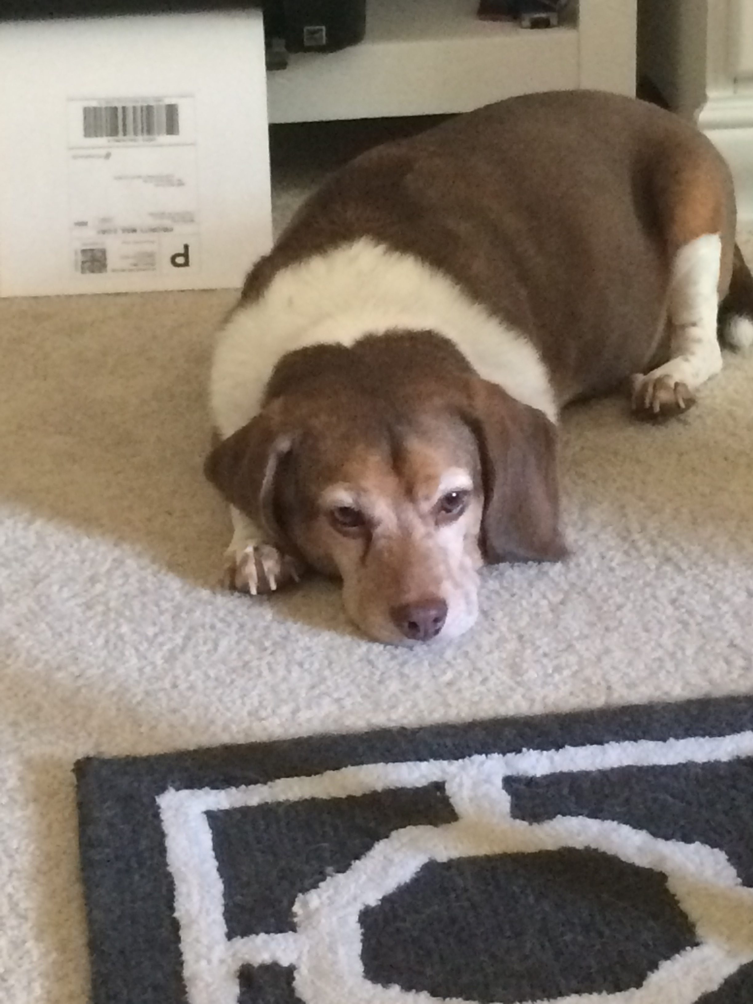
After spending the weekend on the beach in Charleston, I am back in the Rock Hill/ Charlotte area where the weather has decided to be rainy and cloudy all week. Personally I enjoy rain, it gives me an excuse to not take my car to the carwash. Unfortunately, the dark grey skies makes Michelle and I want to go to bed like our furry assistants rather than work!
After several cups of coffee( and for Michelle, several diet Cheerwines) we’ve put the TV on to try to make some noise to keep us up! Beyond the sleepy weather, today I have been working on editing The Scoop List, and making sure all client information is filled out and the store hours for clients on the list are correct. Though going back and forth through windows can be tedious, I break up the time by working on a footer image for The Duke Mansion (an event space that Scoop Charlotte uses frequently) and creating a website layout for Michelle’s new client, Polished.
The latter is my favorite assignment today. In Photoshop I created what I would want the website front and pages to look like. Polished is a nail salon in Charlotte, so I researched ideas of what other salons in Boston and New York had as their website layouts. I decided with a black, white, and grey theme, and since their logo is in pink, I used that color for titles on each page. When designing the layout, the most important thing for me was to make sure all the information was legible. Many times the hardest part of design is the colors and the typography.
Two of the most important lessons I learned in my design classes were: 1. Do not use more than two colors unless it is necessary, and 2. Do not use Comic Sans as a font. Often people think the more colors and the larger the font is, the more eye grabbing the site is. Yes, it is more eye grabbing, and more eye throbbing. A website doesn’t have to look like a box of fruity pebbles exploded to get peoples attention!
I have been doing more work on Hootsuite over the weekend, and I implore people to use this website! I showed several of my friends how it worked and one of them wants to suggest the program to the marketing office at our college! The page where one can view the activity around a post and the interactions is a fantastic tool because it lets one see what posts are the post interesting and also at what times the audience is viewing the most content!
Analytics, marketing, and design are all intertwined(that rhymed!).
